Case study
Thoughts on cooking from a book
Part 1: Introduction
Words:
Victor de Vries
I love a good cook book. They are usually really well designed and written. I love browsing through them, reading through the recipes, checking notes from the authors, adding my own. Wondering about all the ingredients I've never heard of. Slow down, take the time to learn new recipes and their history.

Just a couple of cook books laying around, unused. Image taken from Unsplash.
Here’s what I don’t like about them. There’s big, clunky, overly descriptive. They stain, I can’t put a recipe in my pocket without destroying the book. You get it. From a UX point of view: yes I enjoy them, but no, they’re not particularly usable. When I get a new cook book, I usually try out two or three recipes before it ends on the shelf. What a waste. Despite their beautiful stories, imagery, and unique recipes, most cookbooks still end up as decorative items rather than practical tools to use in the modern kitchen.
I think there’s an opportunity there, and I wouldn’t be a good UX designer if I didn’t try to find a nice digital solution to addresses it.
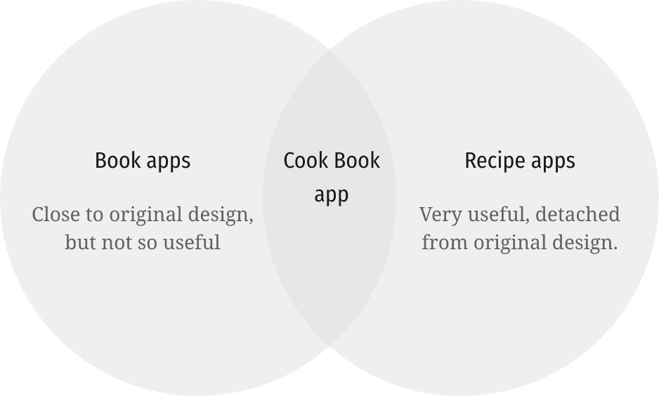
Cooking versus looking
Roughly, there’s two perspectives that are interesting to look at here. First, there’s the ‘I want to enjoy a book’ side. On this side, you’ll find existing digital readers like Google Play Books and Apple Books. These offer very clean interfaces and strong legibility features. They’re great at displaying the pages in a way that is very close to their paper counterparts.
They miss the mark however when looking at the ‘cooking’ side of things. Pages and recipes are static, bookmarks and notes are confined within individual books and cannot be accessed across the entire library. They lack utility in a practical cooking context, where users often need to cross-reference multiple recipes or plan meals across different cookbooks. They’re great for looking at, not so much for using. Or, how one of the people I spoke to for this case study told me:
"I like them more because they are beautiful books (like art books) and don't really use them for what they are intended for, which is the cooking.”
Then, there’s the more practical side: ‘I want to effectively cook from a recipe’.
When looking at practical cooking, there’s recipe management apps. I had a look at CookBook and Paprika, two apps that provide robust tools for organizing and planning meals. They’re both great. They offers things like OCR importing and standardisation of recipe layouts, which are very useful for for managing a large collection of recipes and presenting them in a consistent way.
And they help with the bigger cooking journey as well, with grocery lists and kitchen timers. The flipside of these apps is that they tend to strip recipes from their original look and feel and lack the charm and storytelling that make traditional cookbooks so appealing. The interfaces can be cluttered, presenting a steep learning curve and accessibility concerns, which detract from the user experience.
The goal
There’s a space between these two that hasn’t been filled: a digital experience that not only respects the visual allure of cookbooks but also integrates the practical, interactive benefits found in recipe managers.
I’ve taken on the challenge of exploring what an iPad cookbook app could look like and documented my process in a case study that spreads over five articles. It documents my journey from conducting and documenting user research, through wireframe development and testing and prototyping of detailed mockups.
In five articles (including this one), I have documented this project. Every article outlines
Introduction: In this article, I explored the problem space and looked at some competitors. I introduced the project and outlined my role in it.
Empathy: I started by talking to people about their cooking habits. I wanted to understand their needs, preferences, and pain points. User research is crucial in shaping the direction of any project, and based on my research, I crafted personas and journey maps that helped define a clear and informed problem statement.
Ideation: Next, I went through an ideation process. Exploring various concepts and ideas for the app, I created wireframes that outlined the basic structure and functionality of the app and gathered user feedback through usability tests.
Prototyping: Last, I designed a prototype that closely resembles the final product. This prototype includes detailed designs and interactive elements, providing a realistic representation of the app. I ensured consistency in the design using a design system and finished the process by doing a second round of usability tests and making adjustments and improvements to the app. These changes enhanced the app's core functionality and user experience, ensuring that it meets the needs of its users.
Conclusion: I documented my reflections on the project, and provide recommendations for next steps for further developing this app.
I hope you enjoy reading through this process, and if you have any questions about any of it, please do get in contact with me!